ResultIT.com.au provides Customed Web Services tailored to cater for the distinct needs of every business.
We specialise in Search Engine Optimisation or SEO which is the process of improving the volume and quality of traffic to a web site from search engines via "natural" ("organic" or "algorithmic") search results. Our online marketing services includes Search Engine Marketing or SEM refers to the focus on ensuring that top search engine positions involves editing its content and HTML coding to both increase its relevance to specific keywords and to remove barriers to the indexing activities of search engines. Google Adwords advertising is also part of our online marketing services.
-
Search Engine Optimisation (SEO) gives you return on investment as it cost effectively channels long term sales traffic to your website, saving you dollars on paid marketing.
-

A good web design should bring to the visitors' attention the Unique Selling Point (USP) of your business and hence generate more sales through your website.
-

Simple, Safe, Reliable and Secure web environment for online sales, everyday of the year. Get instant payments and secure those deals.
-

Fast and Cost-Effective way to communicate with your customer base or target market instantly with more time to react to results achieved with your campaigns.
about ResultIT
We specialise in Search Engine Optimisation or SEO which is the process of improving the volume and quality of traffic to a web site from search engines via "natural" ("organic" or "algorithmic") search results. Our online marketing services includes Search Engine Marketing or SEM refers to the focus on ensuring that top search engine positions involves editing its content and HTML coding to both increase its relevance to specific keywords and to remove barriers to the indexing activities of search engines. Google Adwords advertising is also part of our online marketing services.
We have years of experience in Content Management Systems and E-Commerce websites with payment gateways interface especially Online Bookings Management Systems for accomodations. Our Approach to develope a successful website is in the planning and identifying target market and customer feedback. We specialise in business websites including all Standard and Customised Web Design and conversion of Flash to HTML web pages that are SEO friendly. ResultIT.com.au also provides SEO Copywriting that incorporates the targeted keywords for your website.
seo strategy
Search Engine Optimisation (SEO) gives you return on investment as it cost effectively channels long term sales traffic to your website, saving you dollars on paid marketing. read more
- Improve your organic search ranking
- Google Adwords Campaign
- Google Maps Rankings
- Pay-Per-Click (PPC) Campaign
- Pay-For-Inclusion (PFI) Program
web design
A good web design should bring to the visitors' attention the Unique Selling Point (USP) of your business and hence generate more sales through your website. read more
- Consultation and Analysis
- Standard Web Page Design
- Flash to HTML Website Conversion
- Content Management System (CMS)
- Maintenance and Update Services
email marketing
Fast and Cost-Effective way to communicate with your customer base or target market instantly with more time to react to results achieved with your campaigns. read more
- Cut down printing costs for mail-outs, invites, Newsletters, promotions and other business communications
- Target bulk recipients in an instance
- Monitor campaigns
ecommerce
Simple, Safe, Reliable and Secure web environment for online sales, everyday of the year. Get instant payments and secure those deals. read more
- Online Booking Management System
- Online Shopping Carts
- Payment Gateway Interface
- Orders Management
- Member Accounts
Understanding SEO Value
Search engine optimisation or SEO is the process of securing a top 5 ranking in Google, the leading search engine, for competitive keyword phrases.
Top 10 Mistakes in Web Design
What contributes to a good design? What are the top 10 common mistakes that many websites are making? Does a good design contribute to good business?
Effective Adwords Campaign
Reaching people that are actively looking for information about your products and services online, and sending these targeted visitors directly to what you are offering can be made easy with Google AdWords. You only pay when people click on your ad. But how do you stop them from leaving after they enter your ad?
web design portfolio showcase
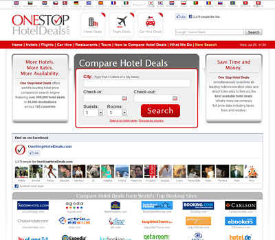
onestophoteldeals.com
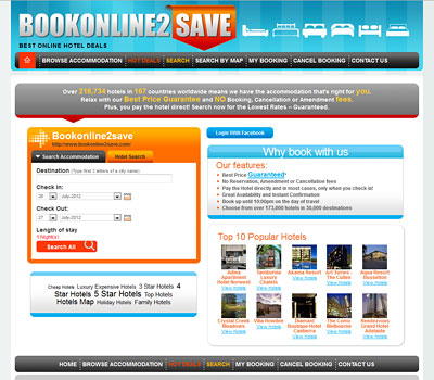
bookonline2save.com
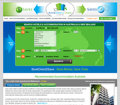
bookdirect2save.com.au
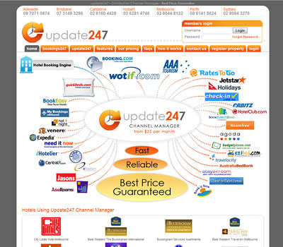
update247.com.au channel manager